AFine particles / closest to digital light
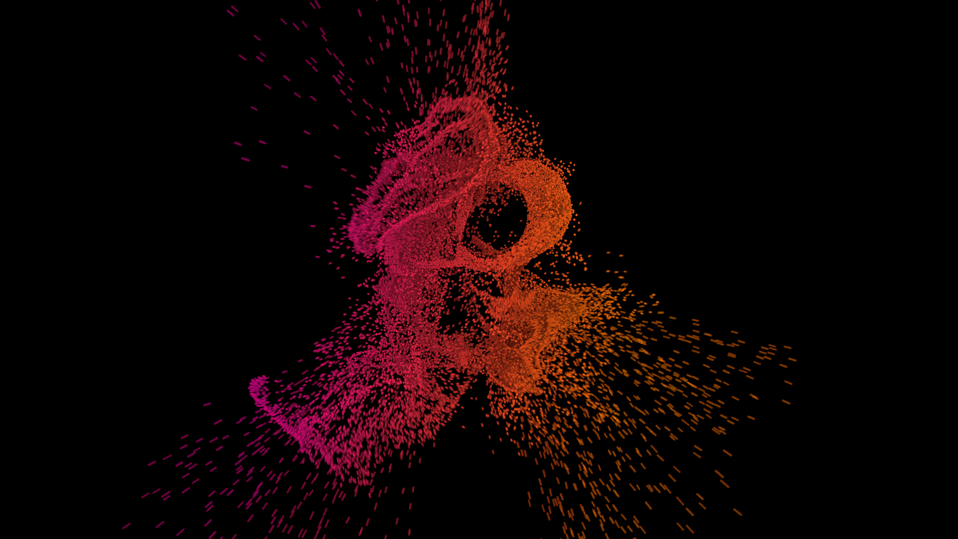
Look at the tiny illuminated units and the depth between them. For ID8: keep the letters readable, with orange particles moving from EATE into 8.
BA whole word assembled from points

Look at how many small elements still read as one word. For ID8: a clear IDEATE resting pose, then the same elements regroup. This preview is a still, not verified animation playback.
CVisible 3D pixels / voxels
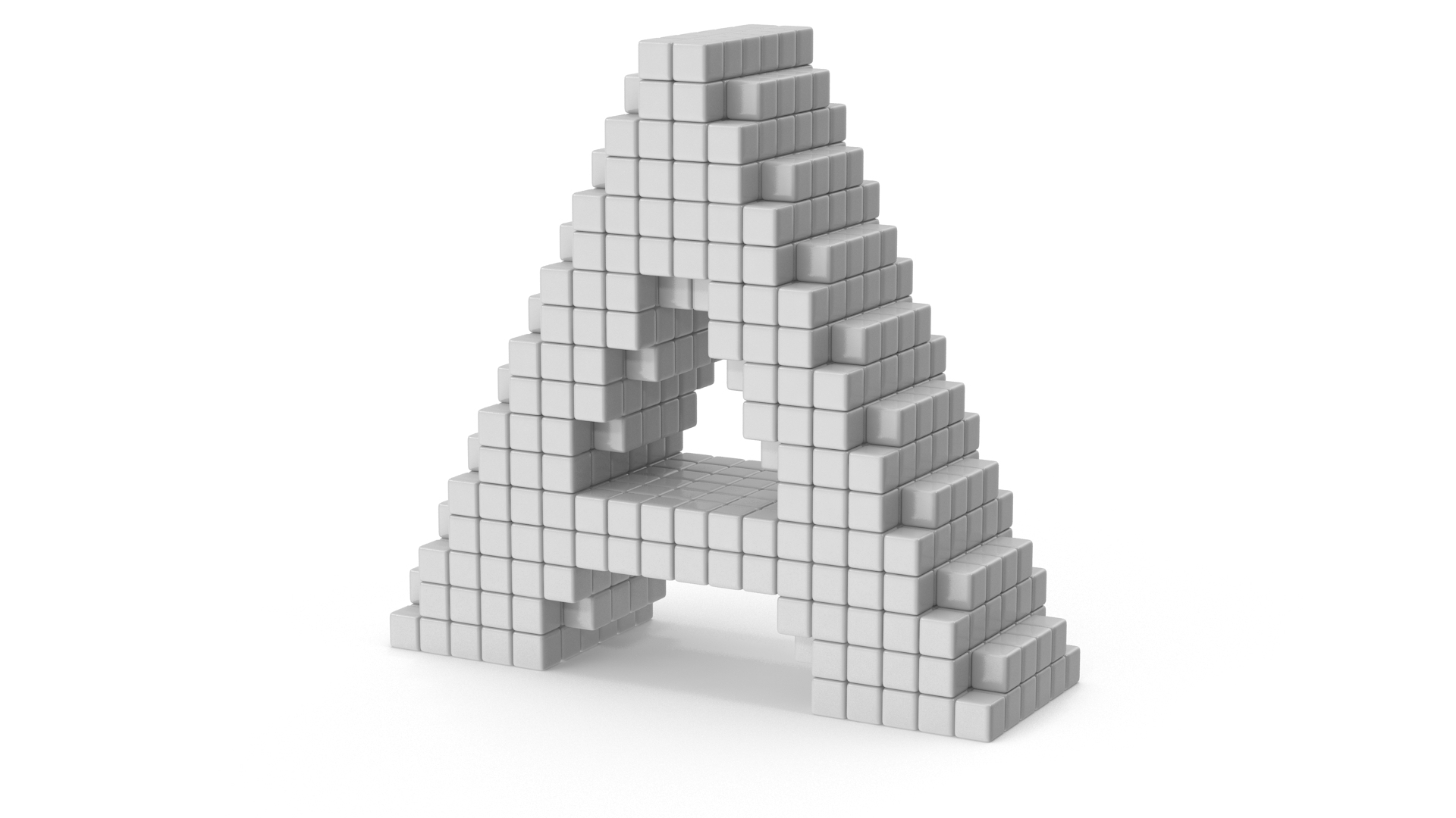
Look at the individual cubes and staggered depth. This is the more tangible pixel option. Borrow the construction, with a dark setting and less glossy material.
DPrecise dotted typography

Look at the rhythm and density of the dots. A quieter, more graphic direction; useful if full 3D feels too heavy. The reference itself is monochrome.
ELuminous text experiments
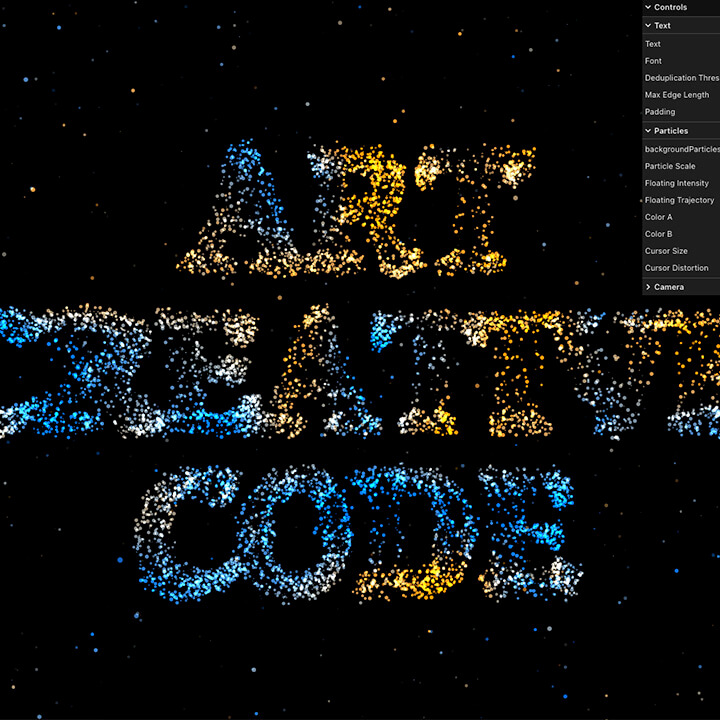
Look at the separation between particles and the dark negative space. Useful for the generated-from-data feeling. This is a small preview; open the source to explore.
FOrange as an interface accent
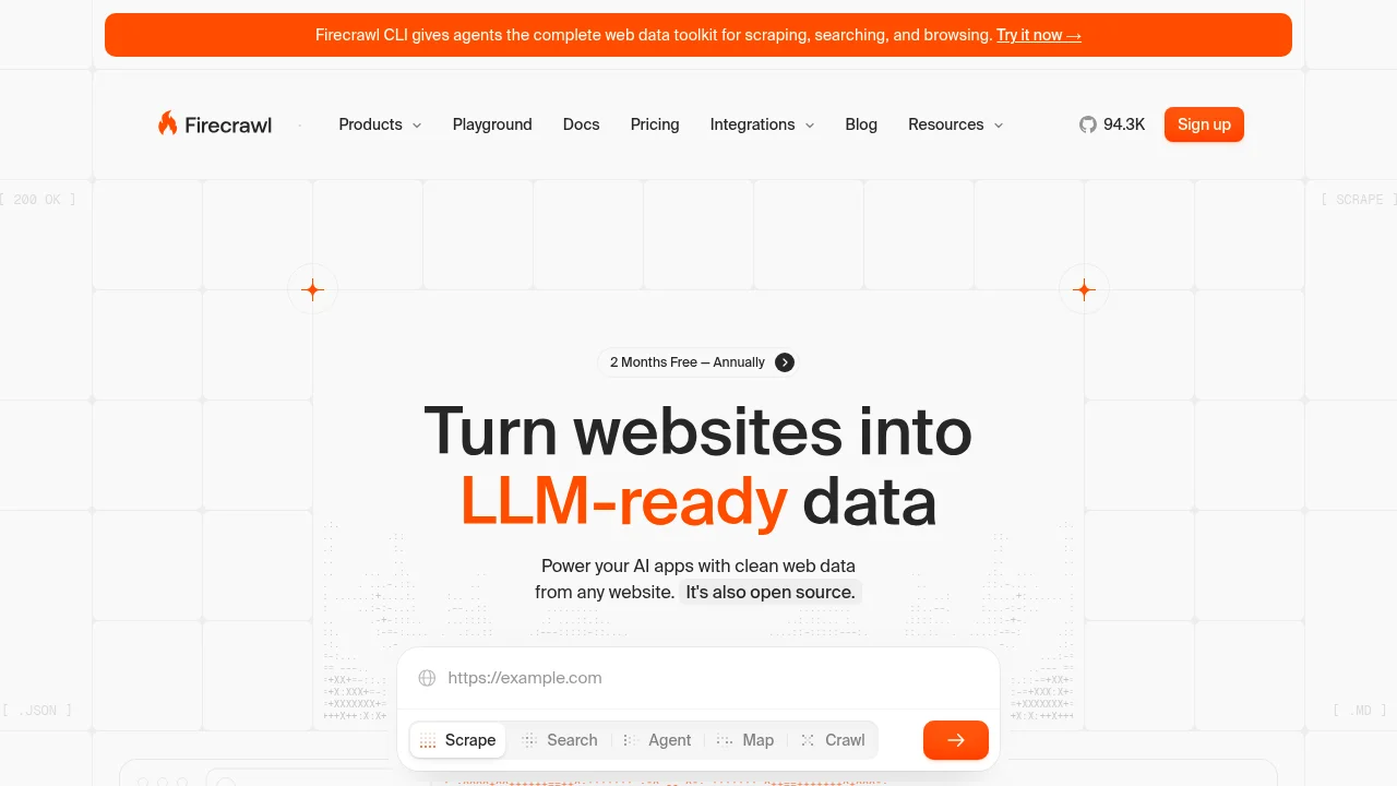
A palette and interface reference, not the hero direction. Borrow restrained orange emphasis and readable product communication; our intended background stays dark.
My starting point: A’s fine luminous particles + B’s readable full word, with only a little of C’s cube depth. If you want more visibly pixelated, start from C instead.
Point to any letter—or combine two. Colour is fixed to dark + orange for the next direction.
Return to V7